Skip to content
“Colour is the finishing touch of everything”- Marc Jacobs
As the above quote from arguably one of the most famous designers in the world points out- colour plays an extremely important role in producing a finished product. With a website this is no different. You can build a beautiful website no problem at all. But without the correct colours to complement it and finish it off then it just won’t be as effective as it could be. That is where Colour Branding comes into play.
One of the most important things that we as web designers need to make sure of when building a client’s site is to make sure we get the correct message across.
Colours can play a large role in doing this as you will find out in this blog post. The good news is it isn’t as difficult as you may initially think. Colours can have a powerful impact on a persons’ behaviour and decision making . This of course affects the success of your website and business which shows the importance of colour choice.
There are 2 main sections in this blog post and they are:
- What different colours “mean” and what message they convey.
- Important things to remember when choosing colours for your site
1.What different colours “mean” and what message they convey.
In this blog post I will show you just how different colours can convey different messages or cause different emotions. I will also give you a couple of examples of each. The Psychology of colour is a fascinating topic in and of itself and would take more than a blog post to explore. Therefore I will give you a basic summary of colours and their use in marketing through Colour Branding.
Red
Red is a colour that we use to capture attention. Think of daily life such as stop signs, fire engines and warning signs. They are all red and the reason behind this is to make people stop, look and pay attention. In much the same way we can use red on our website to make people stop, look and pay attention.
The colour red is associated with excitement, passion, danger, energy, and action. When it comes to colour Psychology red is the colour that provokes the strongest emotion.
If you want to use red on your website it is best used on your CTA buttons or for the most important information. This is of course only true if it contrasts nicely with the main colour of your website.
Coca Cola is of course the most well known use of red on a website and branding in general. Their main brand colour is red and the website reflects that which makes it easy for a visitor to their site to recognise their brand. Please note this is for their main website home page not their other sites which are different.

Another well known red brand is Vodafone. It is a globally recognised brand and red is their main brand colour as can be seen clearly on their website.

Orange
Orange as a colour that represents creativity, adventure, enthusiasm, success, and balance. It can also convey a sense of something being urgent but not overly so.
It is similar to red in that it is an eye catching colour and is good for use on CTAs but it is less intense and therefore less commanding. Orange is also a great way to add a bit of fun to a website. It can make a site come across as serious but playful all at the same time.
For example look at Nickelodeon. This is a children’s TV channel and has been around for many years. It is known for its’ bright orange logo and their website uses the orange colour to make it attractive and fun for children to use.

Another great example in the UK is EasyJet. They are a well known affordable airline and in order to be more affordable they have taken the no frills approach and this is more light hearted. As such they use orange on their site and branding to convey that they are more of a fun airline as opposed to a luxury one and they are also very trustworthy.

Yellow
When most people think of the colour yellow they think of the sun. Something that makes you happy and warm and this is what yellow as a colour on a website wants to convey- happiness, warmth and optimism.
Look at Ikea for example. They sell furniture but why would they want to make customers feel happy and optimistic. Well this comes down to the basic question of who is most likely to shop there? Students moving out of the family home, new parents, newly weds, people buying a holiday home. All these people are celebrating a special milestone in their lives and as such Ikea wants to encourage and celebrate that.

Green
When people see green it tends to make them think of nature, wealth, calm, generosity and a range of other things. In general when it comes to marketing green is a very positive colour and tends to be used a lot by eco brands, health and well being industry and of course luxury brands.
For example look at Harrods. Their brand colour is a dark, luxurious green and that just screams that this is a luxury brand. It is an iconic green and is used subtly on their website to highlight important information and CTAs.

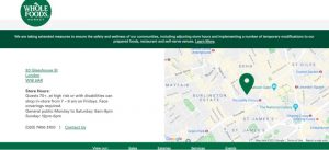
Another great example is Whole Foods Market. Their whole ethos is around healthier, more organic foods and that is reflected perfectly by the use of green in their branding and website.
Blue
Blue as a colour tends to ignite feelings of calm, trust, serenity and peace. As such it is the perfect colour to be used by companies that need their customers to trust them such as financial institutions and those in the health and well being industry. A brighter blue however can show creativity and as such is used by a lot of tech companies (just look at our website!).
An excellent example here is the NHS. They are the leading health care service in the UK and as such it is very important to them that people feel they can trust them.

Another brilliant example is the Bank of Scotland. As a financial institution people need to be able to trust them with their money. By using blue in their branding and on their website they are able to convey their trustworthiness to customers in a subtle and effective way.

Purple
Purple has always been seen as the colour of royalty and as such it gives one a feeling of sophistication, success and nostalgia depending on the shade used.
One thing to bear in mind is that according to Colour Psychology the use of too much purple can give off the appearance of arrogance and may cause feelings of frustration. It is therefore important to note that on a website try to use purple for accents and shipping bars- basically use it to highlight certain things.
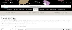
One of the most well known uses of purple is of course Cadburys. They do, after all, have their very own Pantone colour! Their brand is associated with nostalgia and excellent chocolate so what better colour to use on their website.

Also take a look at Hallmark. Again they want their customers to have feelings of nostalgia and good quality. They have used the purple in their logo, menu and important notices so as not to overuse the colour.

Black
Black as a branding colour is a bold choice. It conveys the message of being classy, different, bold and powerful. It tends to be a great colour for those catering to a wealthier clientele and with a more expensive product.
Take a look at Hotel Chocolat. Their products are of the highest quality, their packaging is classy and their prices are not cheap. They use black on their website as a highlight colour and it is very effective.
Gucci made an amazing website for their Marmont collection. As you can see below their use of black just screams expensive, bold, classy and powerful.

White
White is always a safe choice. It is classy, sophisticated, simple and clean. And because it is so bright it makes for an eye catching website. Another plus is that there are a lot of colours that contrast with white. This makes it is easier to contrast other colours with it to make more of a statement.
Apple is an iconic use of white. Their website tries to convey that like their website their products are elegant, easy to use, and eye catching.

And there is of course our site which uses white as the main colour. We then use our bright pink and blue from the logo as accents on the website. This gives us a bright, eye catching, easy to navigate website that isn’t bombarding anyone visually with too much information. It also makes our images and text stand out brilliantly and this is what we want.

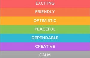
This image shared by Oberlo (@oberloapp) on May 4, 2018 at 8:12am PDT sums up brilliantly what each of the colours mean to us in marketing (white and grey have a similar meaning).
2. Important things to remember when choosing colours for your site- Colour Branding
1. It is important to remember that white space (space without text/images) on a website is not a bad thing. And it is most definitely not a waste of space if used correctly. It can make a page easier to use, more eye catching and it can make it easier to have certain information pop out of the page.Don’t clutter your page if you don’t need to. White space allows a persons’ eyes to rest and breathe instead of becoming instantly overwhelmed by an overabundance of information.Whitespace can make your website look balanced, make CTAs stand out more and highlight important parts of your site.For example look at Pocket Penguins. Their homepage uses white space brilliantly to draw your eye to their logo, name and product. There is nothing else there to distract you.

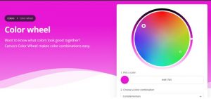
2. When choosing your colours the safest and most effective method of doing so is to use the colour wheel.Canva has an amazing colour wheel tool to help you find not only complimentary colour combinations, but also the Hex/RBG/Pantone number of those colours. https://www.canva.com/colors/color-wheel/
3. Colour plays an important role in brand recognition. For example you are well aware that you are on the Coca Cola website just by the use of red.
The same recognition of colour is evident in brands such as Cadburys, Google and many more.
According to a study done by the University of Loyola, colour can increase brand recognition by up to 80% and that is not a small number so it is well worth putting in the extra effort.
Look at the below image. There is no mention of a brand name but simply by looking at the colour and the text it is recognised as Cadburys.

4. Colour branding is a very important step in building an image for your business. It can also play a big role in influencing how your business is viewed by others. Therefore it cannot be based on the business owner’s favourite colours or even the colours of the logo.
You need to think about and consider what colours will best convey what your brand is. You also need to decide what colours will encourage a more positive reaction on your site.
“Be uniquely you. Stand out. Shine. Be colourful.” – Amy Lee Mercree
Take Amy Lee Mercree’s advice and make your website STAND OUT!
5. If your client has made up their mind about their colour then it is up to you, the designer, to find complementary colours. If you think they are making a bad choice then ask them questions such as: Why it was chosen? How do they feel about it? Has anyone commented on how they feel about it? And of course what image they want the company to convey?
6. CTAs will have a higher rate of success if they stand out more. This can be effectively achieved using colour. In fact the correct choice of colours can make anything stand out on a website. This is another reason why Colour branding is so important.
There is no one colour that is better than another for a CTA. Therefore sometimes it is a good idea to play around with them and see what works best for you. Look for one with the highest contrast and use that!
As an example look at our home page. The header and CTA button ‘Get a Quote’ are both in bright pink which makes them stand out.